MÁXIMA NORDESTE (2023)
TECHNICAL INFO: 2 videos:
1. HD (5:4) – 2’29”
2. 2K (16:9) – 2’29”
ENVIROMENTS: Processing
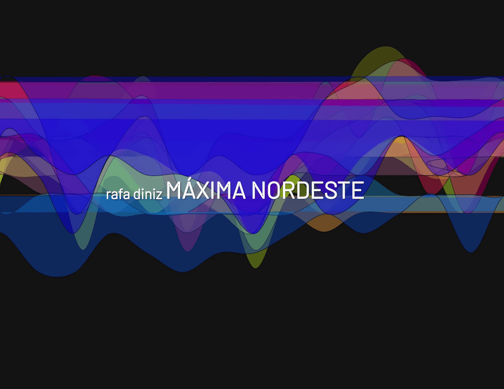
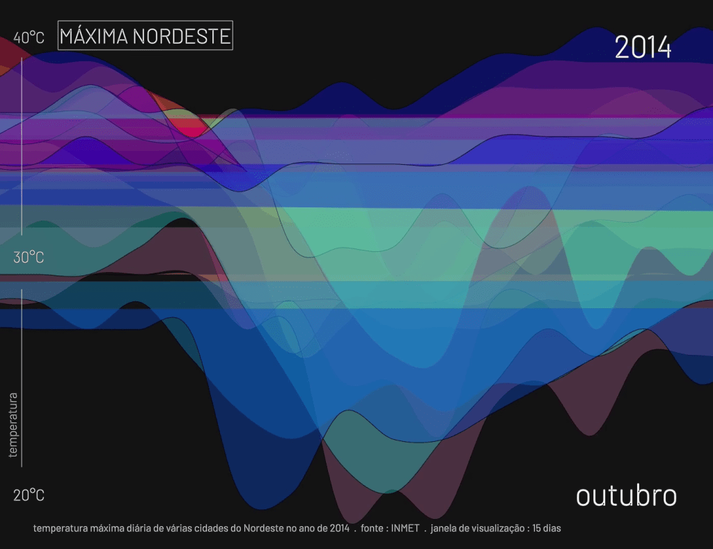
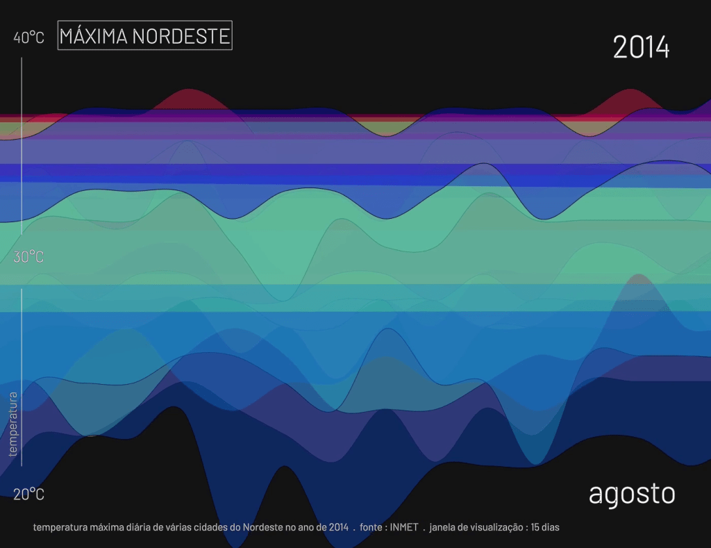
My first work with data visualization. I obtained daily maximum temperature data from 113 cities in the Brazilian Northeast between 2010 & 2020 from the INMET website (National Institute of Meteorology). In this first video, I chose the year 2014 and data from 25 cities to show the maximum temperature curves during the year. The temperature data – mapped into MIDI messages and sent to a virtual synthesizer – was also used to generate one of the layers of the musical part
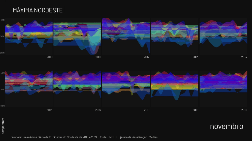
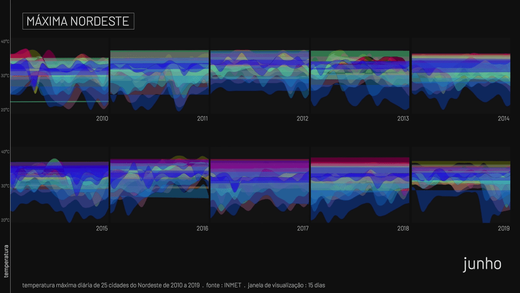
In the second video of the MÁXIMA NORDESTE series, data from 25 cities are used, so the maximum daily temperature curves during each year from 2010 to 2019 are shown simultaneously.
Beyond its undeniable aesthetic innovation, the project exposes, in a visceral way, an alarming climatic reality. The translation of raw data into sound and image not only humanizes scientific information but amplifies its urgent meaning: the temperature curves, especially when overlaid in the second animation, suggest a consistent and widespread warming trend in the region. The rising notes in the synthesizer and the visual intensification become direct metaphors for the ongoing environmental collapse. This work, therefore, transcends artistic experimentation to become an eloquent and disturbing testimony to the climate crisis, questioning to what extent we are willing to listen—literally and figuratively—to the warning signals the planet is emitting. The hypnotic beauty of the visualization deliberately and critically contrasts with the silent gravity of the phenomenon it represents, inviting reflection on our passivity in the face of an increasingly hot and hostile future.